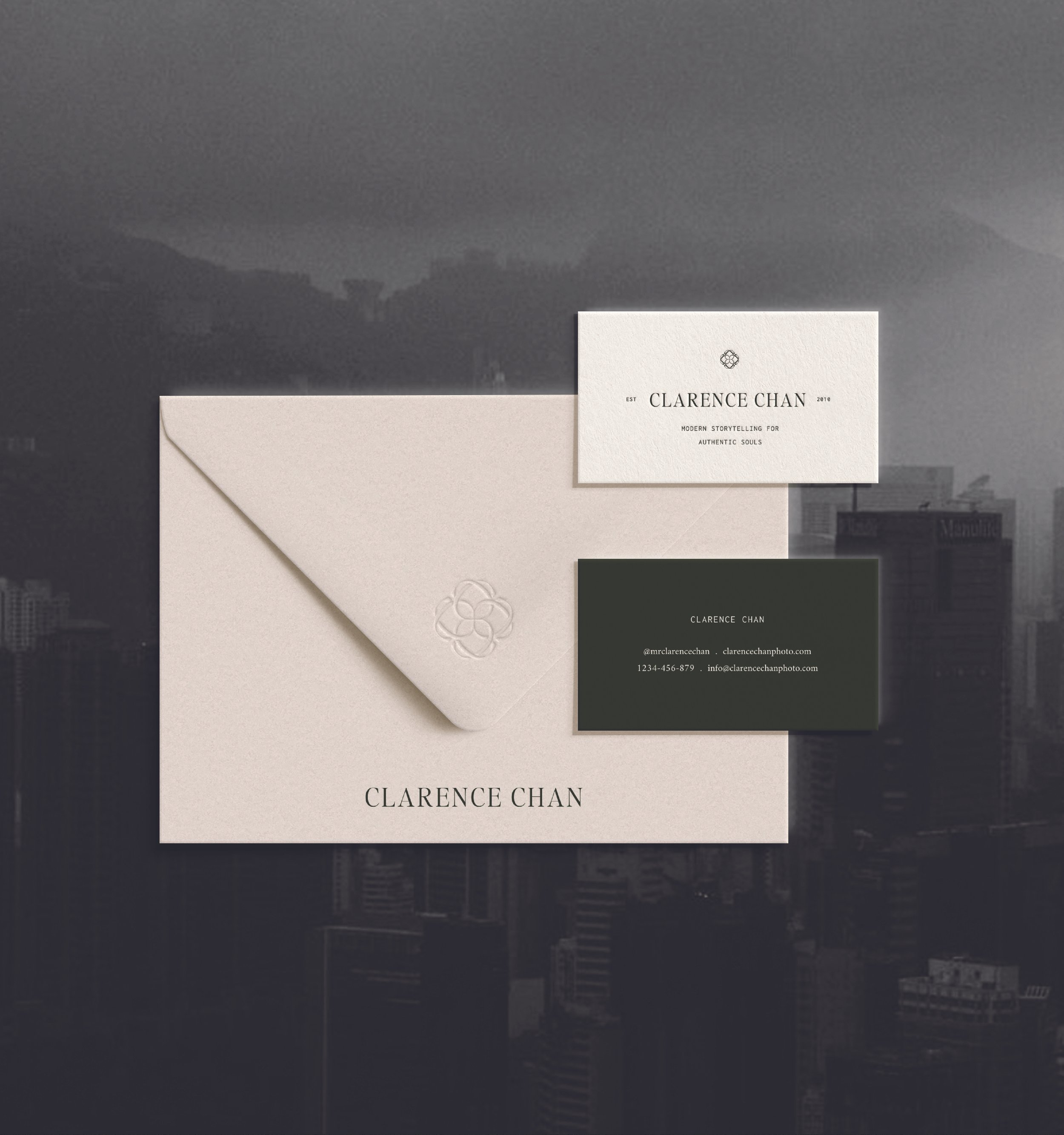
Clarence Chan
- branding (PreMIUM INTENSIVE)
About Clarence Chan:
Clarence has a natural, subtle and emtive approach to his work, capturing the honest stories of his couples. Based in New York but working worldwide, he has been honing his craft for over a decade. In his words: “I’m thankful that I get to be a storyteller that helps people feel those moments over and over again.”
Design Concept:
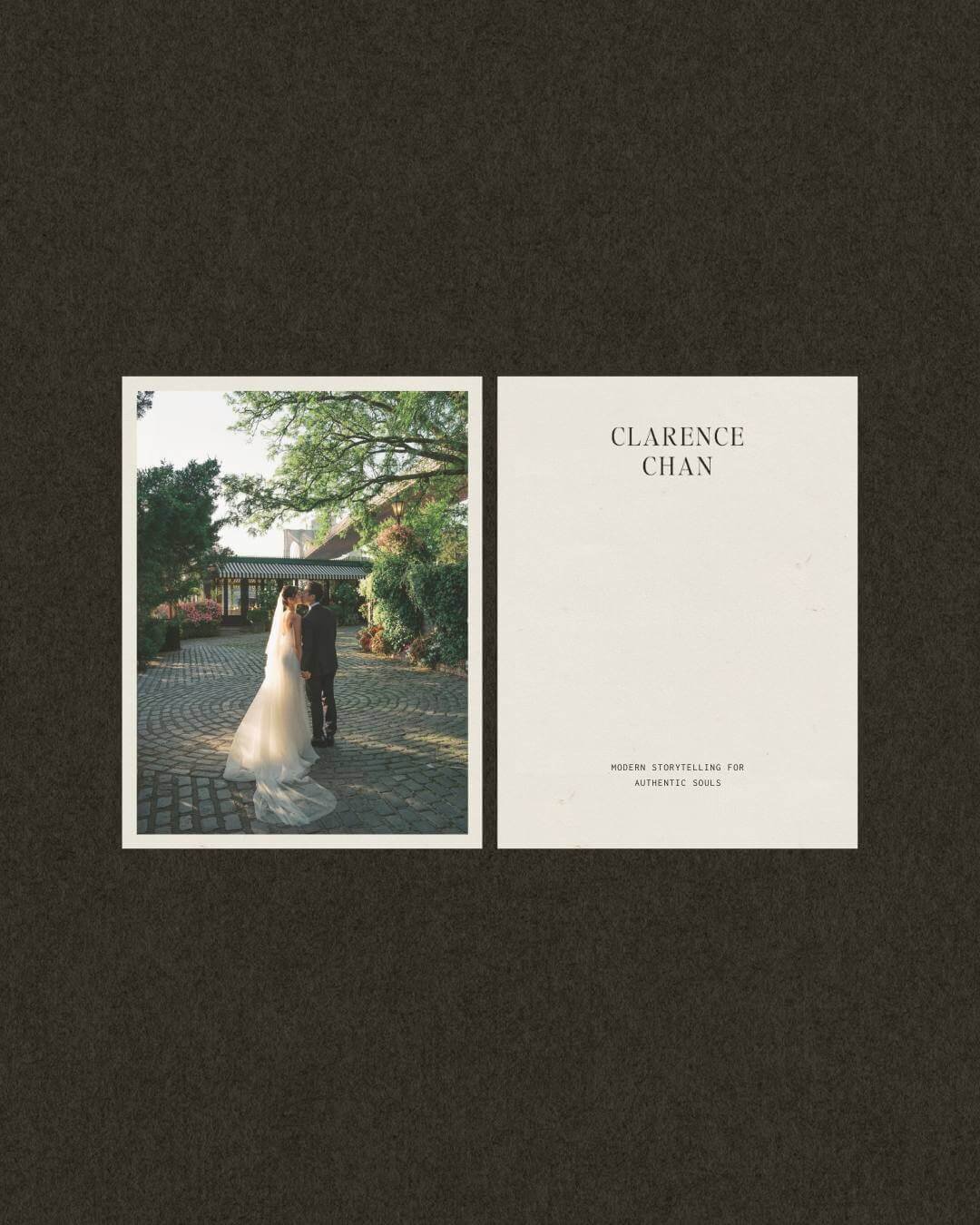
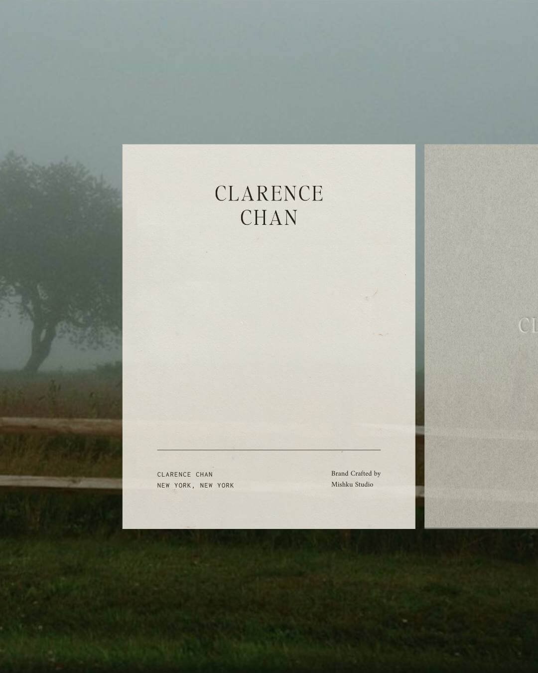
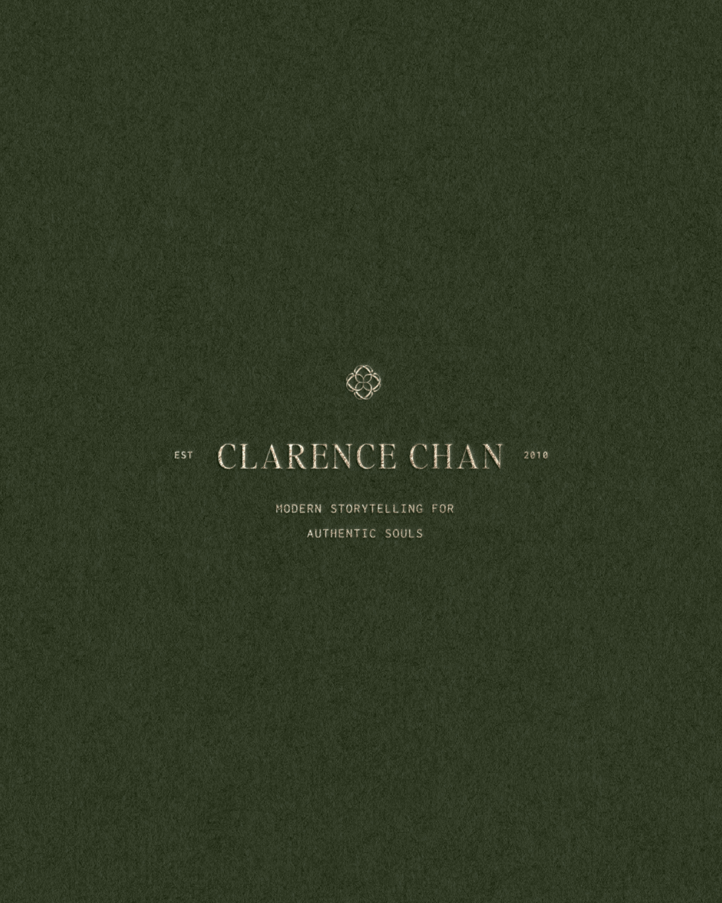
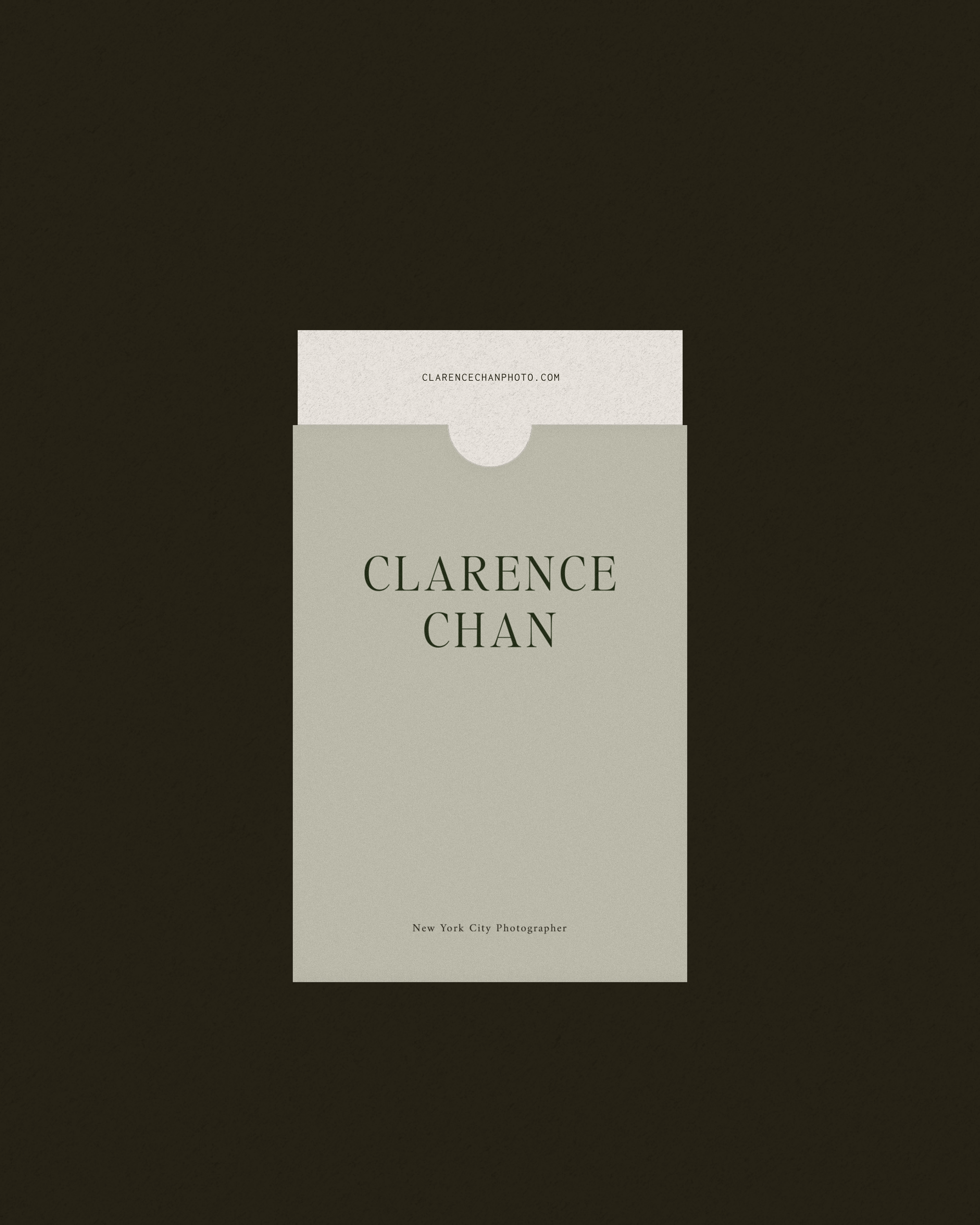
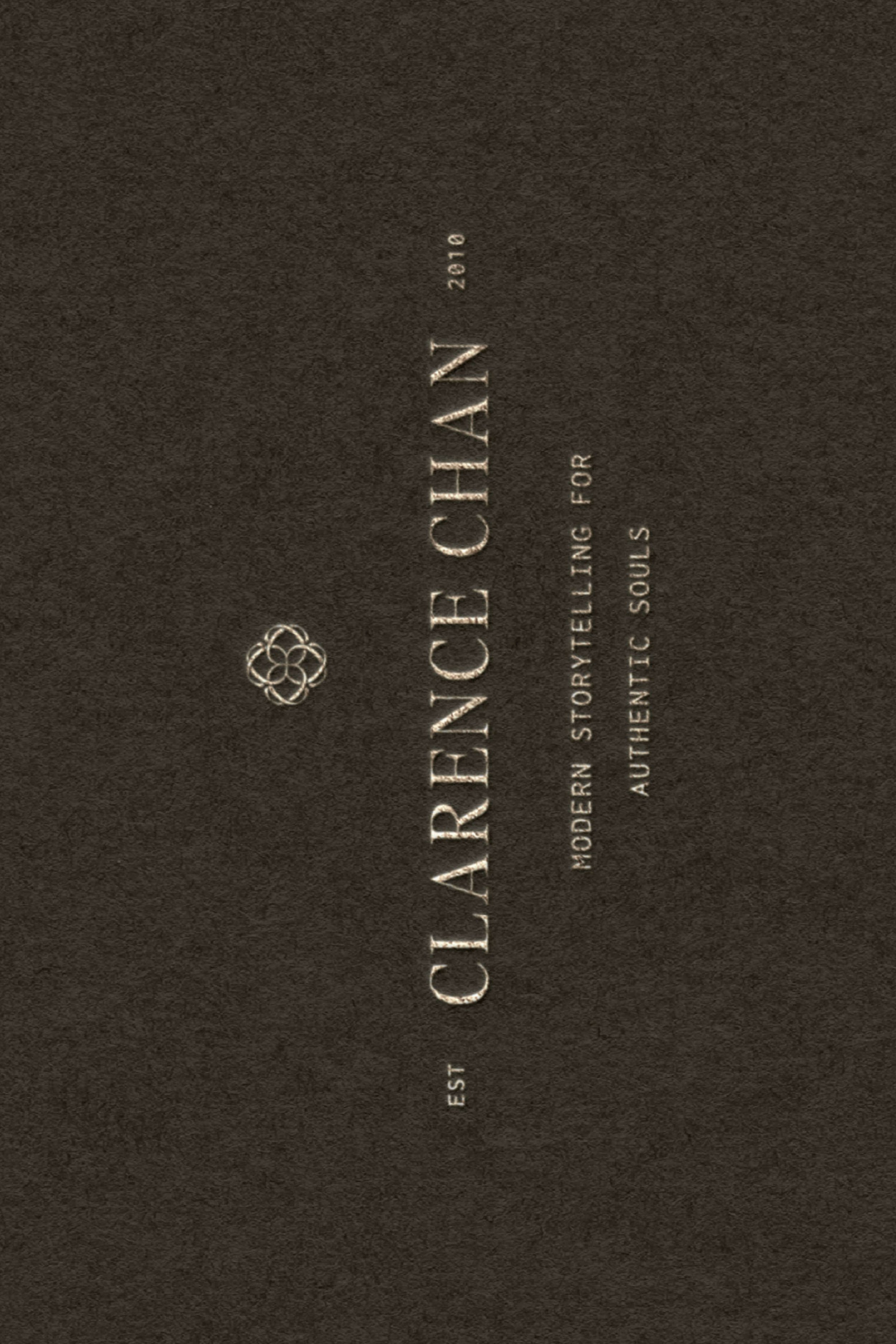
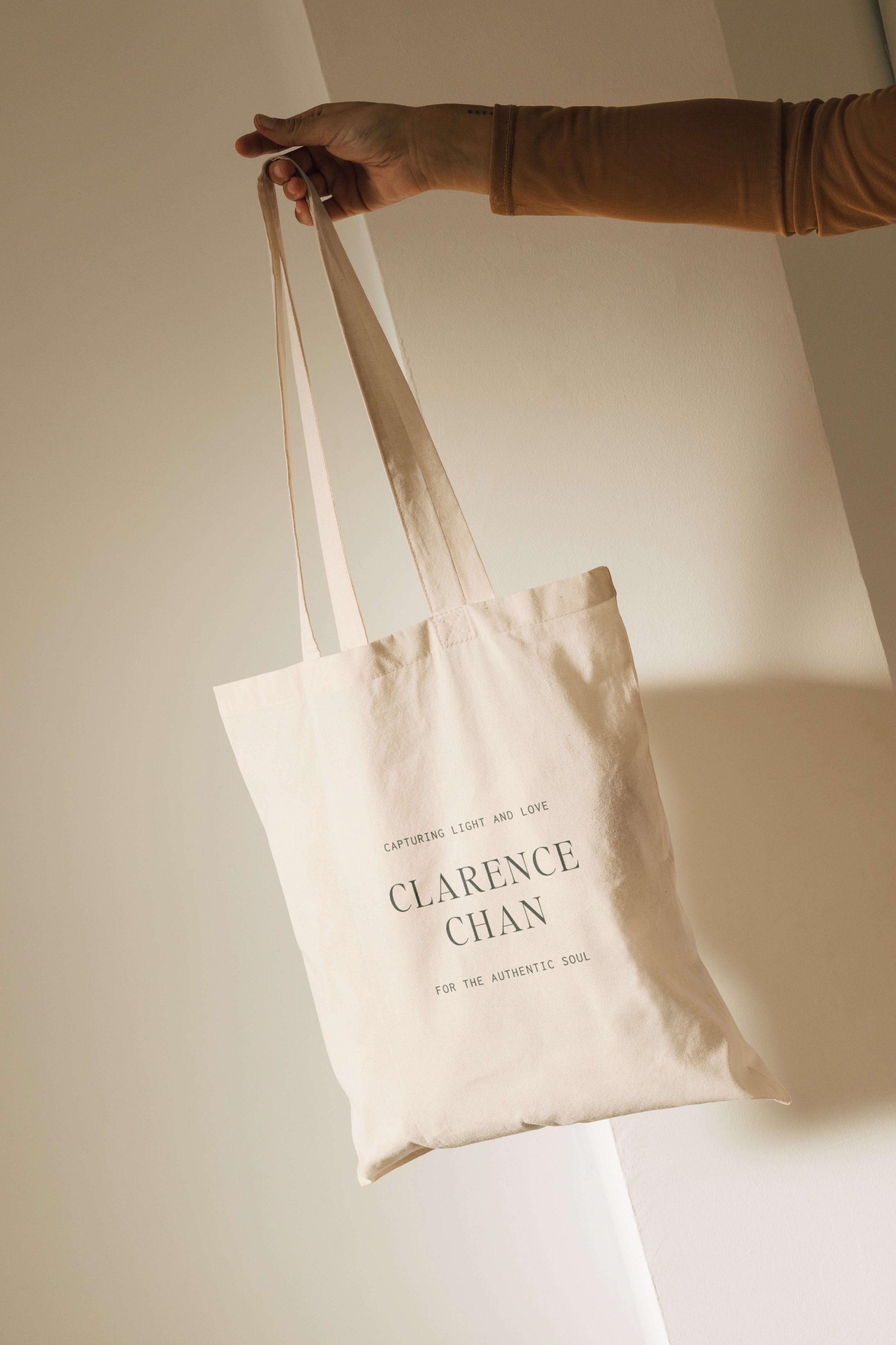
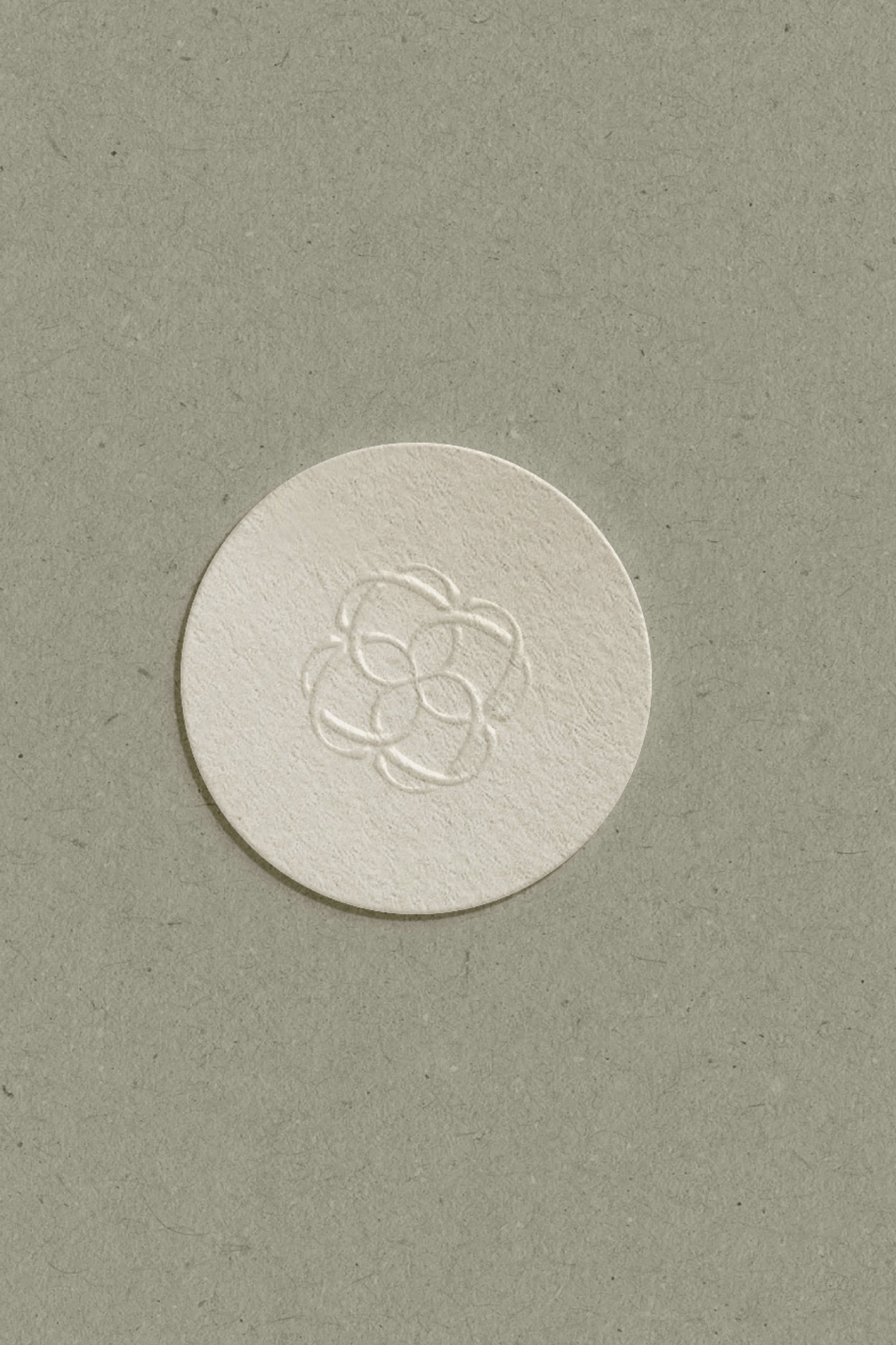
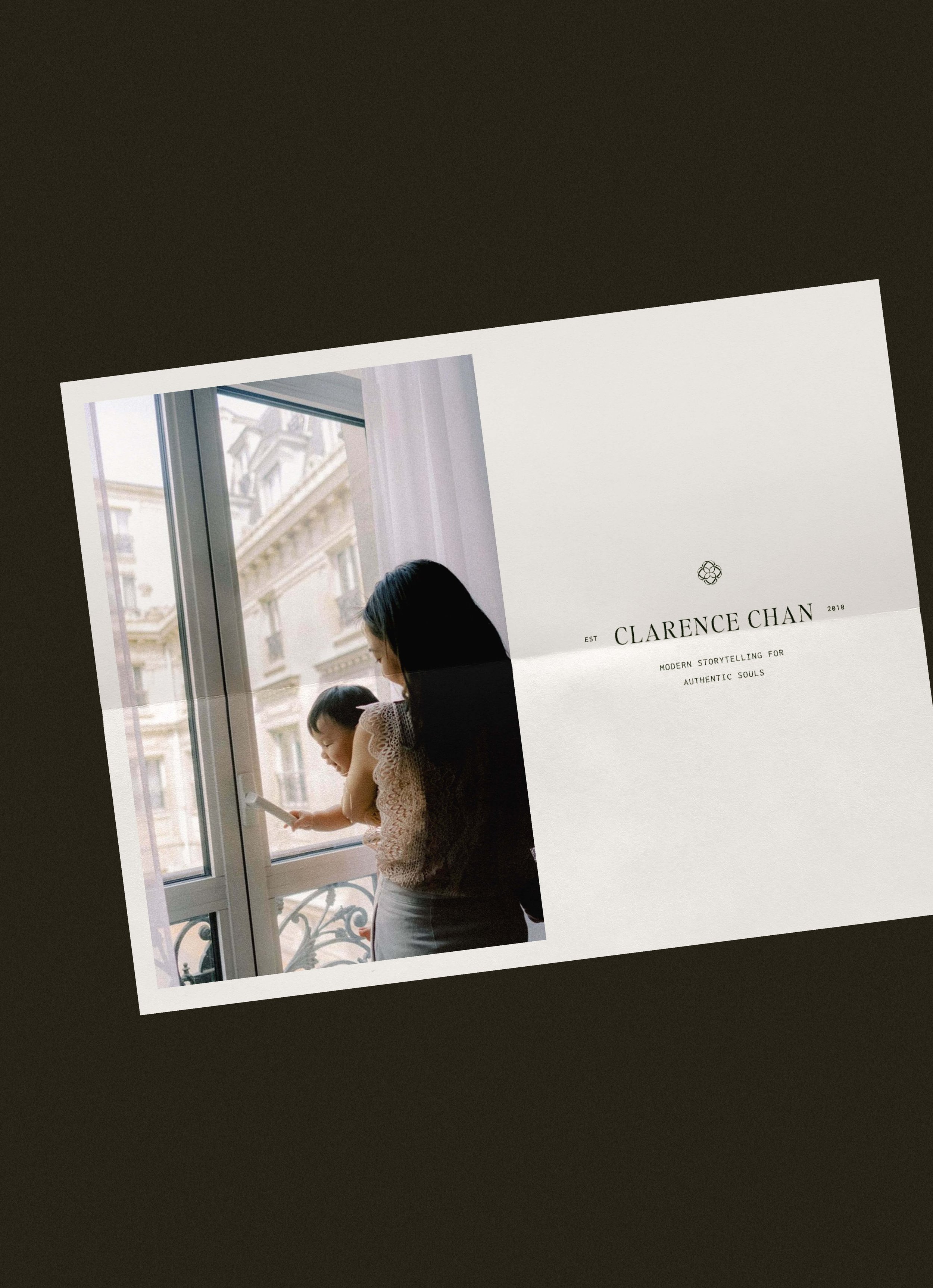
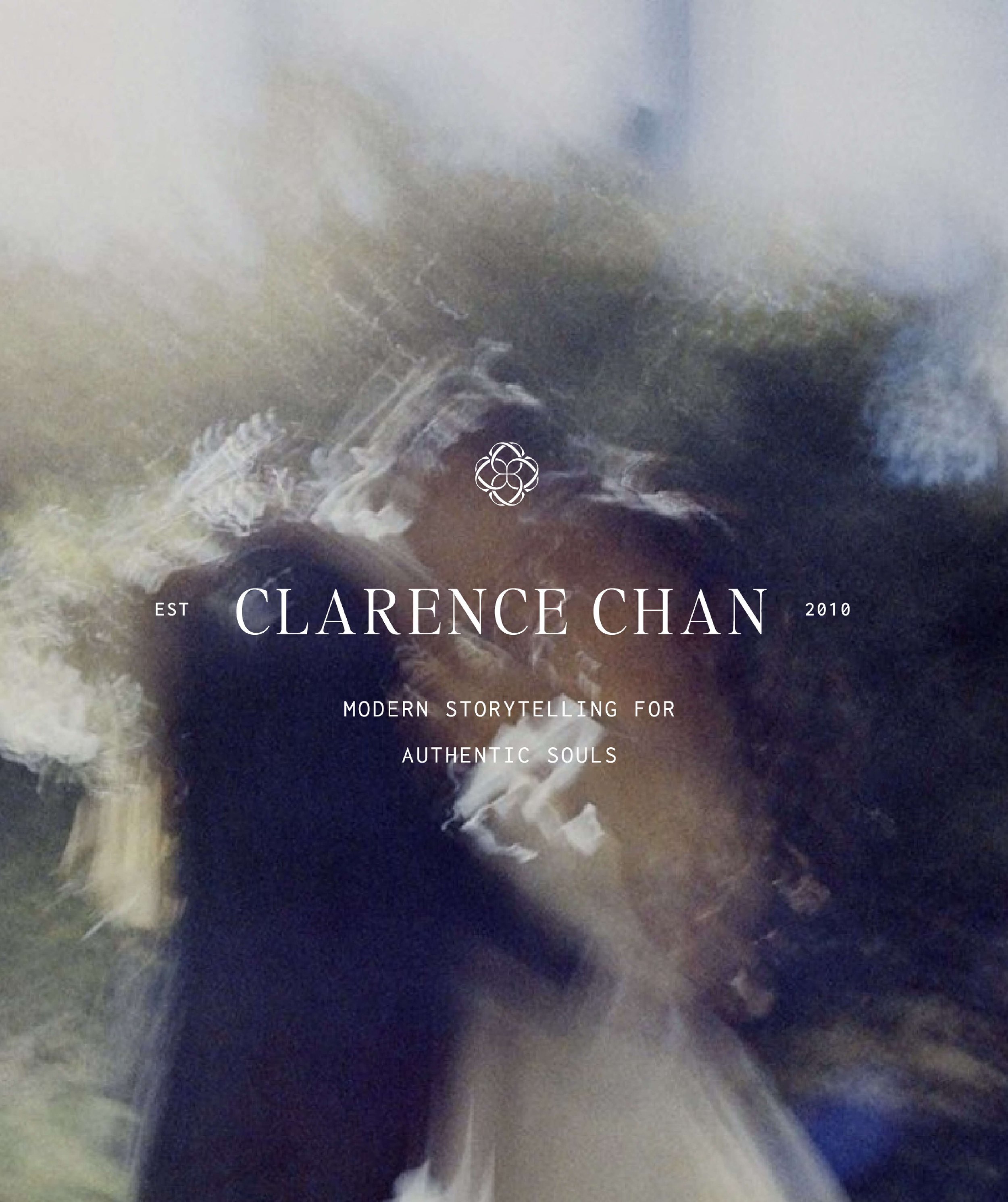
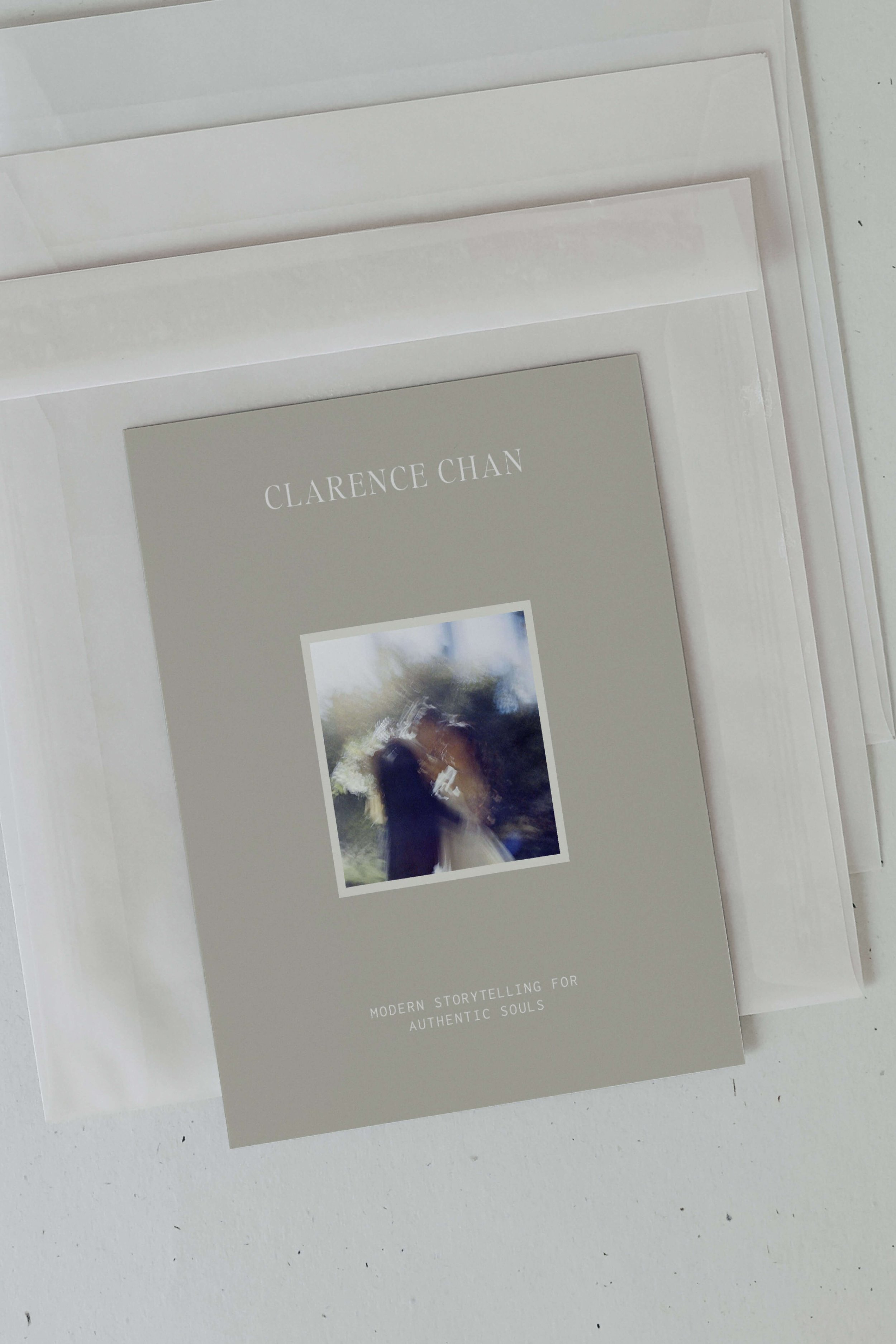
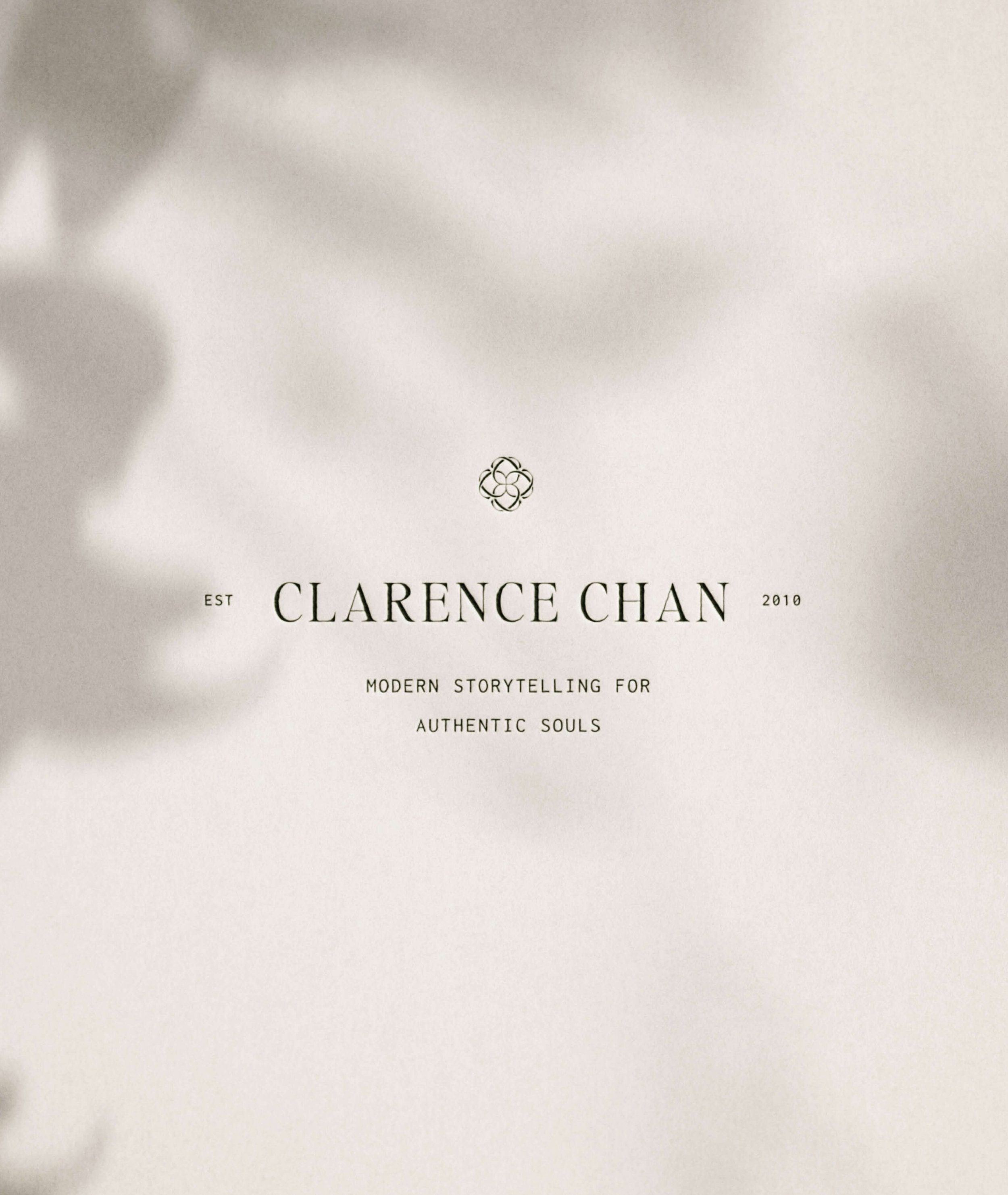
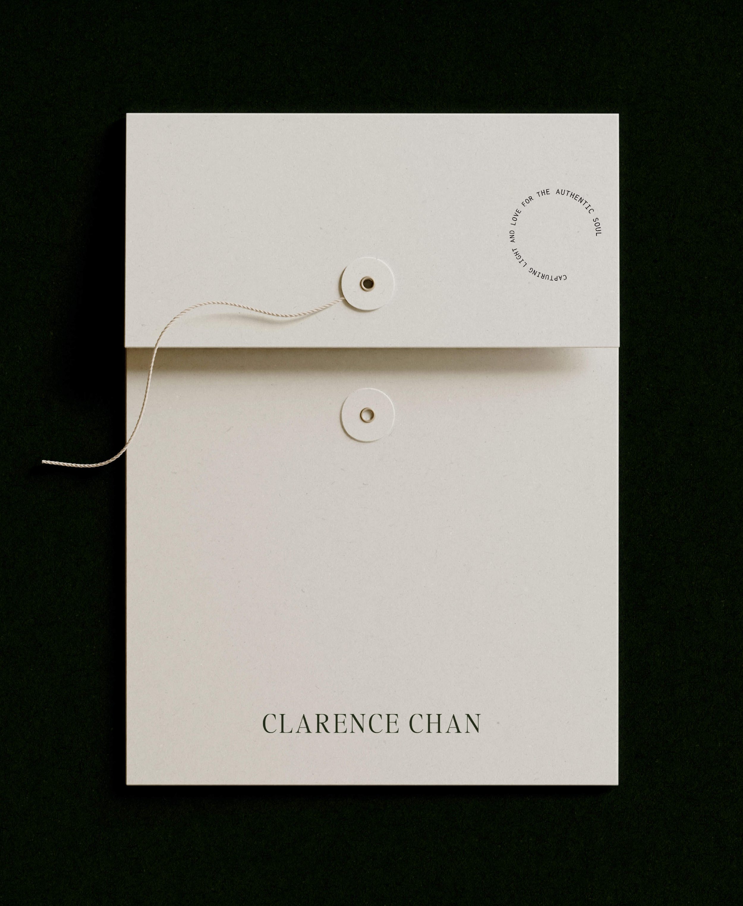
For the logos, we went for a timeless, classic and artful style that isn’t too bold or over the top to suit the same feel of Clarence’s work. For the sub-logo, we wanted to explore a design with a bit more visual interest - the submark is Clarence’s initials (CC) formed into an interlocking emblem. We wanted it to feel structured yet incorporate organic elements.
For the color palette, we incorportated a distinctive rich forest green that complements Clarence’s film scan preferences and offers a sophisticated yet modern feel. We kept it simple by using the main tone, tints of the secondary colors, and a darker shade for typography and made sure to cross-reference the tones to ensure they worked well with the colors in his imagery.

